
Finpargo
The Project
Finpargo was an entrepreneurial project that crowd-sourced parking for large events. The app connected residents wishing to rent out spaces in their yards with fans attending the event. While the client hoped to eventually target many types of large events, the MVP would primarily target the college football fans and tailgaters.
The Problem
Currently, many residents near large stadiums rent spaces in their yard on gameday. While this can be a lucrative and reliable source of additional income, it’s not efficient for the resident who has to spend the entire day sitting in their yard monitoring and selling spaces. In addition, yard parking relies on a “first come, first served” model that’s dependent on who shows up earliest instead of being better monetized for those who would be willing to pay more but aren’t interested in showing up early.
For fans, it’s inefficient and frustrating to drive around neighborhoods in circles looking for a place to park. Fans who show up late are stuck parking far away from the stadium, because the best parking spots go to those who arrive hours before the game. Tailgaters are also often looking for specific amenities, such as additional space to congregate and restroom access, which is difficult to orchestrate the day of the game.

My Role
As lead UX designer on this project, I was responsible for the majority of the design process, including competitive analysis, wireframes, and documenting user stories. I worked closely with stakeholders to design a product that addressed their stated problem.

Competitive Analysis
We wanted to explore other apps working in the space that Finpargo was targeting to determine potential competitors in the space and how others were tackling similar problems. We found multiple spot-sharing apps that had found traction in the market including Pavemint and Park-it, but they were more focused on parking in urban environments for commuters. A few competitors did target the same college football parking issue that Finpargo wanted to address, but the existing players were poorly designed and seemed to no longer be in use.
Finally we looked at other solutions being utilized for the same problem, and found that Craigslist was the most common. However, due to the generic nature of the site, it was cumbersome to use for gameday parking, as you had to sort through many unrelated ads. Only a small percentage of the entire market was using Craigslist, leaving the traditional “drive around to find a spot” method the vast majority.

Whiteboarding
In our view, the biggest challenge to the success of Finpargo would be the app’s ability to quickly grow an even market of both renters and homeowners, generating supply and demand, and delivering both user types a satisfying experience. After initial meetings with the client, we worked on whiteboarding the app with a focus on customer acquisition that would allow both sides of the market to grow as quickly as possible.
To allow first-time customers to quickly orient themselves to the app, we focused on a fairly simple, traditional interface combined in intelligent ways. To achieve this, we kept renter’s interaction to 3 primary screens, representing the three steps of their process:
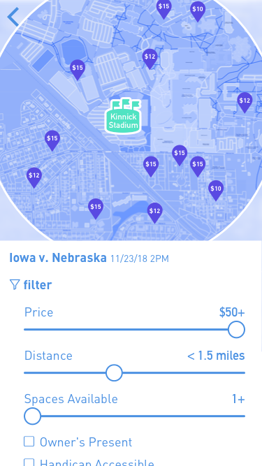
Select the event they’re interested in
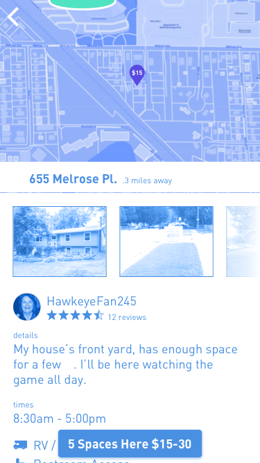
View a map and select a potential parking place
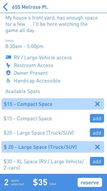
View details about that parking place.
The Solution
With the basic structure in place after whiteboarding, we also wanted to consider more invested users without getting in the way of our simple workflow. We developed a list of needs that a potential customer might have in when searching for a parking spot, from price and proximity to accessibility and restrooms. From there we created a simple system of easily-accessible filters to allow users to further refine their choices before selecting a spot.
While creating the clickthrough, we focused on building the entire app in a way that would allow for elegant transitions. Each screen would transform into the next in a way that allowed users to progress without losing their sense of place in the app.


The Outcome
When we presented the final designs of the app to the clients, it was apparent that the simple streamlined workflow would differentiate them from the other failed solutions that had tried to address this problem. They were excited about the outcome and took the designs to be used to generate further VC funding.
